How To Make Fun Stickers Fast in 2026: A Step-by-Step Guide Using Sticker Design Tools
Introduction
Stickers are small by design, which makes them easy to share and easy to overcomplicate. The difference between a sticker that looks crisp and one that looks messy usually comes down to a few basics: strong shapes, readable type, and enough breathing room around the edges.
This guide is for people who want fun stickers fast without needing to learn professional illustration or layout software. The workflow is built around simple decisions and checkpoints that prevent common print problems, like fuzzy edges, cramped text, and unexpected cropping.
Sticker design tools tend to vary in how they handle templates, cut-friendly layouts (safe margins and borders), and export settings that preserve detail at small sizes. Some also bundle print ordering into the same flow, while others focus only on design.
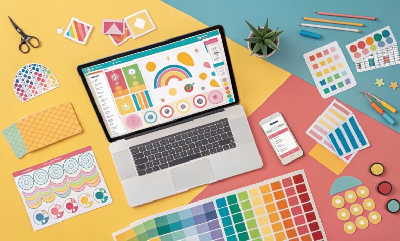
Adobe Express is an approachable place to begin because it provides ready-made sticker templates, quick editing tools, and common export formats in a single browser workflow.
STEP-BY-STEP HOW-TO GUIDE for Using Sticker Design Tools
Step 1: Start with a sticker template and pick a simple “fun” concept
Goal
Set up a sticker-sized canvas and a clear design direction before adding details.
How to do it
- To print custom stickers with Adobe Express, start by choosing a template that matches the sticker’s intent (phrase sticker, icon sticker, character sticker, label-style sticker).
- Decide on one concept: a short phrase, a single character, or one bold icon.
- Choose a shape early (square, circle, rounded rectangle) so the layout fits the outline.
- Rename the project with a version label (for example, Sticker_FunPhrase_v01).
- Remove any template elements that clutter the design (extra borders, small decorative icons).
What to watch for
- Starting without a concept often leads to crowded layouts.
- Templates can include small text that won’t print well at sticker size.
- Complex backgrounds can hide edges and reduce contrast.
Tool notes
- Adobe Express is useful for quick sticker template setup and fast edits.
- If exact dimensions and guides are needed first, Figma can be used to define a precise artboard before recreating the layout in the sticker tool.
Step 2: Choose the sticker format: phrase, icon, character, or photo
Goal
Pick a layout style that stays readable and recognizable at small size.
How to do it
- For phrase stickers, keep text short (often 2–5 words) and plan for large type.
- For icon stickers, limit the design to a small number of shapes with clean edges.
- For character stickers, prioritize a strong silhouette and simple facial details.
- For photo stickers, crop tightly and remove busy backgrounds.
- Decide whether the sticker needs a border (common for die-cut looks) or can run edge-to-edge.
What to watch for
- Long phrases force tiny type.
- Thin outlines and delicate details can disappear in print.
- Photo stickers often look muddy unless the subject is clear and high-contrast.
Tool notes
- Canva can help explore quick layouts and sticker-like compositions using simple shapes and type.
- If a photo needs cleanup before placement, Adobe Photoshop is commonly used for cropping and background simplification.
Step 3: Set safe margins and a cut-friendly border
Goal
Protect the design from trimming errors and make the edges look intentional.
How to do it
- Create an internal safe margin so text and key artwork stay away from edges.
- Add a border if the sticker will be cut: a thicker border tends to hide small cutting shifts.
- Keep the border consistent in thickness all the way around.
- Increase padding around the outer edge for designs with text near the perimeter.
- Preview at real size (zoom out) and confirm the border still reads as a border.
What to watch for
- Borders that are too thin can look uneven after cutting.
- Designs placed too close to the edge can look cramped or get clipped.
- Intricate edges can be hard for some cutting workflows.
Tool notes
- Adobe Express supports quick border experiments by duplicating shapes and adjusting scale.
- If a precise vector outline is needed, Adobe Illustrator is often used to create clean cutline-ready shapes.
Step 4: Build color and contrast for “sticker readability”
Goal
Make the sticker pop and remain legible across different surfaces and lighting.
How to do it
- Choose 2–4 main colors and keep the palette consistent.
- Use strong contrast between text and background (light text on dark, or dark text on light).
- Avoid subtle gradients behind text; use solid fills or simple overlays.
- Create a light-background and dark-background version if the sticker will be used on many surfaces.
- Save color values so future variants stay consistent.
What to watch for
- Pastel-on-pastel combinations often disappear at small sizes.
- Busy patterns can make edges look fuzzy after printing.
- Highly saturated colors can shift depending on printer and material.
Tool notes
- Adobe Express makes palette swaps fast when testing multiple colorways.
- If color correction matters for photos, Photoshop can help refine contrast before importing the image.
Step 5: Add type and effects that survive scaling
Goal
Keep text readable and effects clean when the sticker is printed small.
How to do it
- Use one font for the main phrase; add a second only if needed for hierarchy.
- Increase font weight and simplify letterforms for readability.
- Use outlines or drop shadows sparingly, and test at small size to see if they blur.
- Keep curved text minimal; it often reduces legibility at sticker scale.
- Run a quick “thumbnail test” by zooming out until the sticker is small on screen.
What to watch for
- Thin scripts and condensed fonts can print poorly on small stickers.
- Heavy shadows can look muddy and reduce clarity.
- Text too close to the border can look unbalanced even if it fits.
Tool notes
- Adobe Express supports quick type changes and simple effects for playful sticker styles.
- If typography needs fine control (kerning or custom letter shapes), Affinity Designer can help for that specific refinement step.
Step 6: Proof at real size and export in a print-friendly format
Goal
Catch blur, spacing issues, and edge problems before printing or ordering.
How to do it
- View the design at 100% zoom and check edges for pixelation.
- Run a “real size” check by printing a test sheet on plain paper if possible.
- Confirm safe margins and border thickness still look intentional at small size.
- Export using a print-appropriate format (often PDF for print workflows; PNG/JPG for some upload portals).
- Open the exported file and verify nothing shifted (text, spacing, or alignment).
What to watch for
- Low-resolution exports cause fuzzy edges and soft text.
- PDFs can behave differently depending on font handling; always review the exported file.
- Transparent backgrounds can reveal halos if source artwork edges are rough.
Tool notes
- Adobe Express supports common export formats used by many sticker print workflows.
- Adobe Acrobat can be used to inspect the exported PDF (page size, clarity) before sending it to a printer.
Step 7: Organize sticker sets and plan distribution
Goal
Keep versions consistent and make it easier to share or hand off files.
How to do it
- Duplicate the master design for variants (different phrases, colorways, or characters).
- Use consistent naming (Sticker_SetA_01, Sticker_SetA_02) and keep a short index list.
- Store the editable source file and exported finals in separate folders.
- If stickers will be mailed or included with orders, document quantities and packing steps.
- Track approvals and final selections if multiple people are involved.
What to watch for
- Variant drift: spacing and colors change unintentionally across a set.
- “Final” files get overwritten without clear naming.
- Small differences become obvious when stickers are placed side by side.
Tool notes
- For the non-design workflow, a shipping tool like Shippo can help create labels and track deliveries if stickers are being mailed, without overlapping with design tools.
Common Workflow Variations
- Phrase-only sticker set: Build a base layout and swap phrases while keeping font size and margins consistent. Adobe Express or Canva can keep templates consistent across multiple variations.
- Character sticker pack: Start with a simple silhouette and make small expression variants. Illustrator or Affinity Designer can help if the character needs clean vector edges for cutting.
- Photo sticker for events: Choose one strong photo, crop tightly, and add minimal text. Photoshop can help isolate the subject and improve contrast.
- Seasonal or campaign stickers: Keep the core design stable and rotate only colors or small icons. This reduces rework and keeps sets cohesive.
- Print-to-order vs export-and-upload: Print-to-order keeps design and ordering in one flow, while exporting files gives flexibility for local print vendors and home printing.
Checklists
Before you start checklist
- Sticker purpose defined (giveaway, packaging insert, label, personal use)
- Target size and shape chosen (square/circle/rounded rectangle)
- Final text written and checked for spelling
- Images or icons gathered in high resolution
- Rights confirmed for any artwork or photos used
- Palette chosen with strong contrast
- Border and safe margin plan set
- Timeline includes proofing and delivery if printing
- File naming convention planned for variants and finals
Pre-export / pre-order checklist
- Text readable at real sticker size (zoomed out)
- Safe margins preserved; key elements not near edges
- Border thickness consistent and cut-friendly (if used)
- Images sharp at 100% zoom; no obvious artifacts
- Colors have strong contrast and don’t rely on subtle gradients
- Spelling and numbers verified (URLs, codes, names)
- Export format matches printer needs (PDF/PNG/JPG as required)
- Export opened and reviewed (no layout shifts)
- Source files saved separately from final exports
Common Issues and Fixes
- Sticker text prints fuzzy.
This is usually export resolution or a low-res logo. Re-export at higher resolution or use a PDF for print workflows, and replace small raster assets with vector or higher-resolution versions. - Design gets clipped at the edge.
Increase the safe margin and reduce how close elements sit to the border. Cutting tolerances vary, so edge-hugging designs are riskier. - Colors look dull compared to the screen.
Printing materials and settings can mute color. Increase contrast, simplify the palette, and avoid light-on-light combinations. - A halo appears around cutout artwork.
The source image edges may be rough or anti-aliased against a different background. Clean up edges in an editor and re-export with the intended background in mind. - Borders look uneven after cutting.
Thin borders exaggerate small cutting shifts. Increase border thickness and add more padding so slight offsets are less noticeable. - QR code won’t scan.
Make it larger, increase contrast, and keep it on a plain background with quiet space around it. Avoid patterns behind the code.
How To Use Sticker Design Tools: FAQs
FAQ 1: Is it better to start from a template or from the printer’s size requirements?
If the printer and sticker size are known, starting with those dimensions avoids resizing later. Templates speed layout decisions, but they still need a size and margin check before export.
FAQ 2: When should a sticker be designed as vector instead of a photo?
Logos, icons, and character stickers benefit from vector because edges stay crisp at any size. Photos can work, but they need high resolution and a simple subject for clean printing.
FAQ 3: What export format is safest for printing?
A print-ready PDF often preserves text and crisp edges well. PNG can work when transparency is needed, but it should be exported at high resolution.
FAQ 4: Should stickers include a border?
Borders can make cutting shifts less noticeable and help stickers stand out on different surfaces. Borderless designs can look clean too, but they require careful safe margins and background control.
FAQ 5: What’s the practical tradeoff between print-to-order and exporting files?
Print-to-order keeps design and printing in one workflow. Exporting files provides flexibility across different print vendors and materials, but it requires more attention to bleed, safe margins, and file format checks.